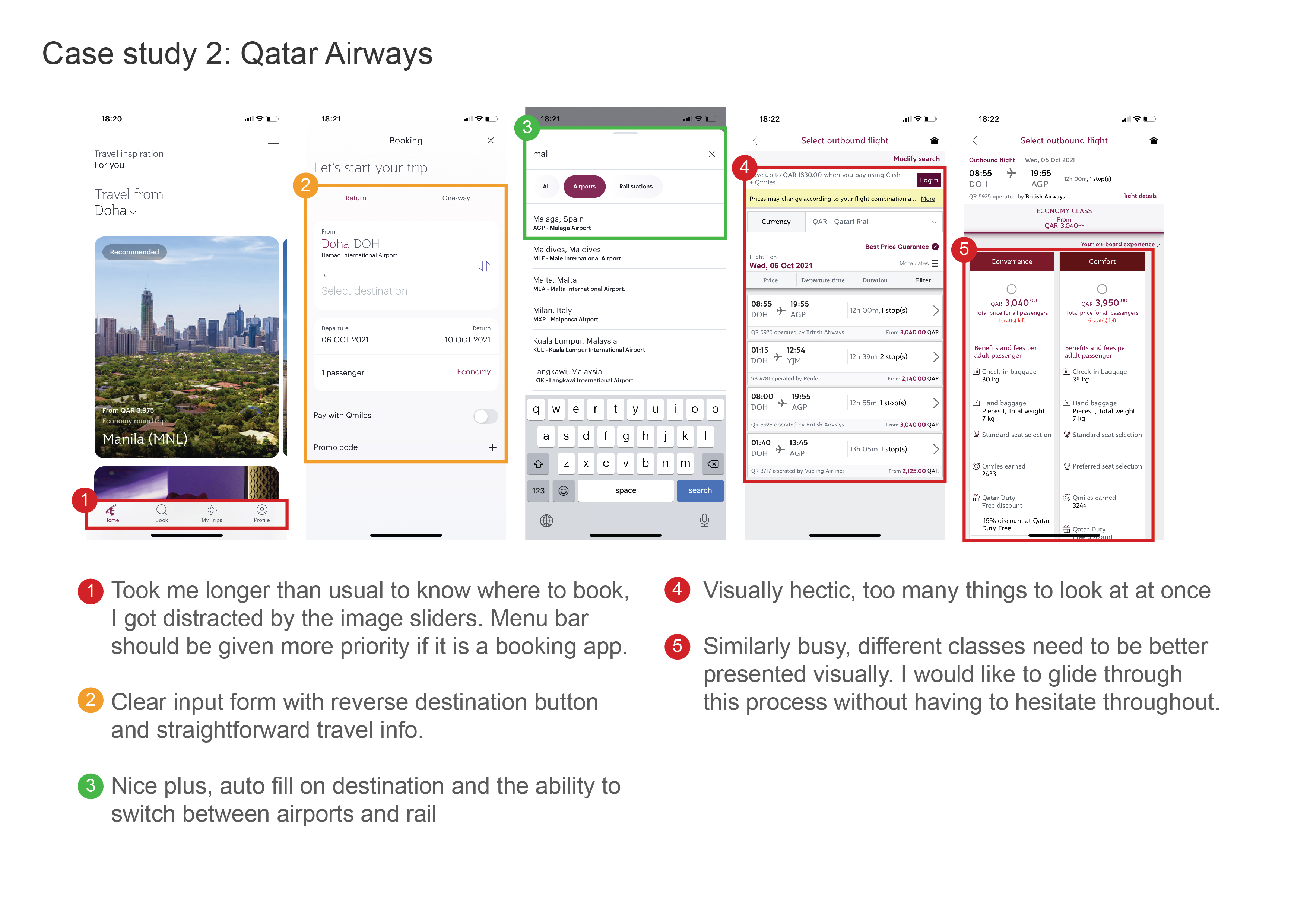
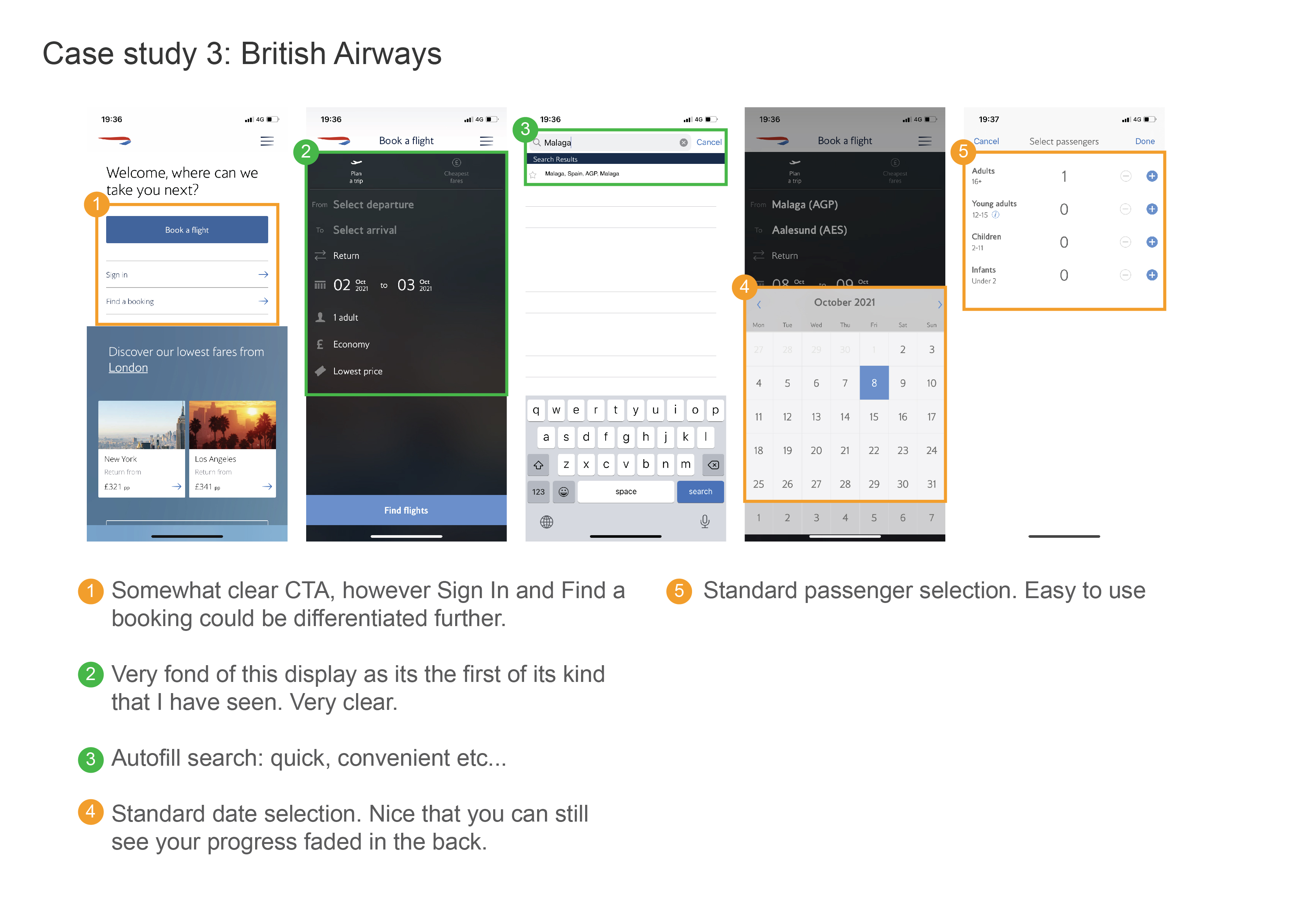
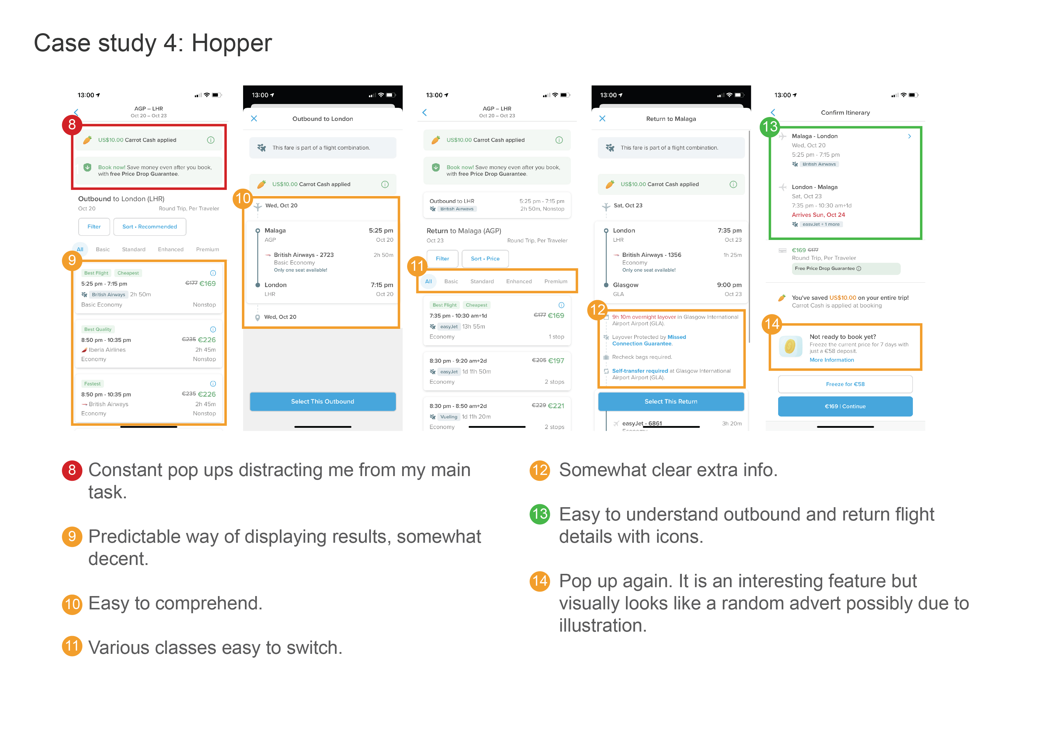
AirAtlas, an airline app which promises a fast, easy and intuitive booking process for travellers of all ages.
Product Goal
The main purpose of the mobile app was to provide the quickest and easiest booking process for Air Atlas customers.
User problems
It was evident that in many competing airline booking apps the booking process had many pain points which hindered the users flow. This took form in irrelevant suggestions and complicated disordered layouts among other things.
End product
The app was designed to be clutter free and straight to the point from start to finish. Designed with a strong visual hierarchy and bold text, it makes the booking process that much more simple and easy to flow through.
Product Goal
The main purpose of the mobile app was to provide the quickest and easiest booking process for Air Atlas customers.User problems
It was evident that in many competing airline booking apps the booking process had many pain points which hindered the users flow. This took form in irrelevant suggestions and complicated disordered layouts among other things.End product
The app was designed to be clutter free and straight to the point from start to finish. Designed with a strong visual hierarchy and bold text, it makes the booking process that much more simple and easy to flow through.The Process:
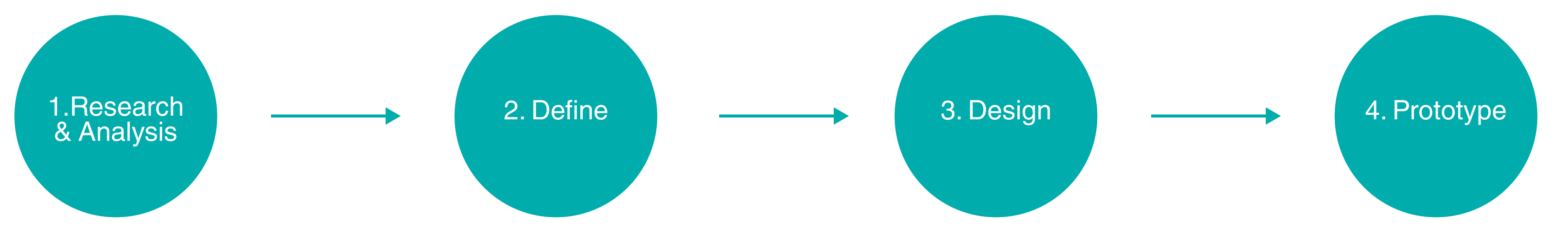
1. RESEARCH & ANALYSIS:
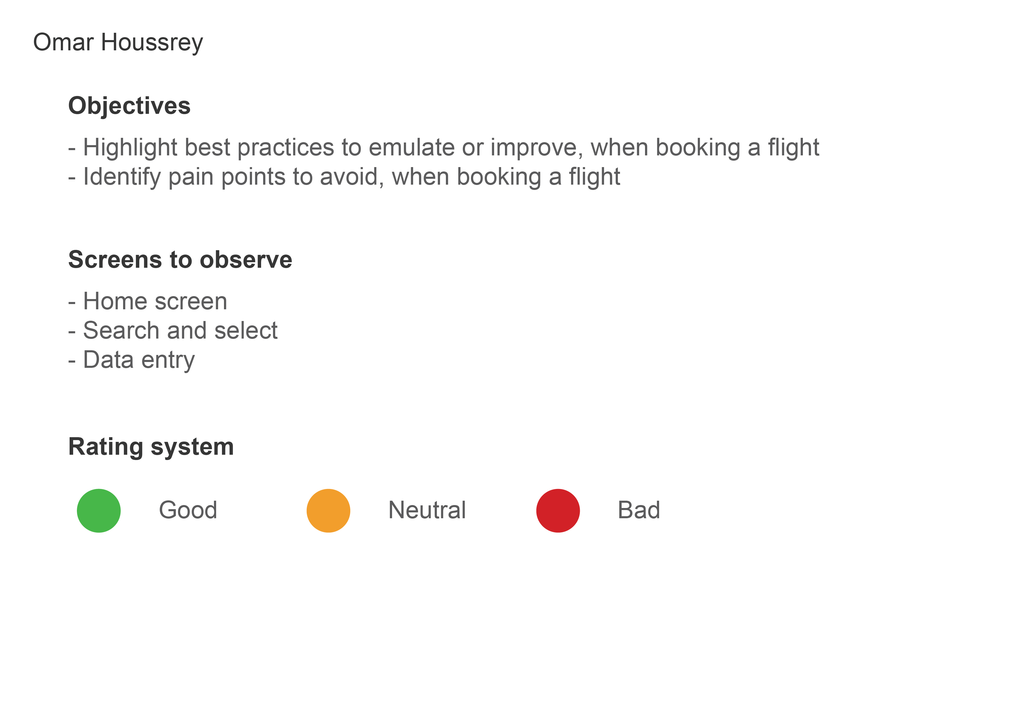
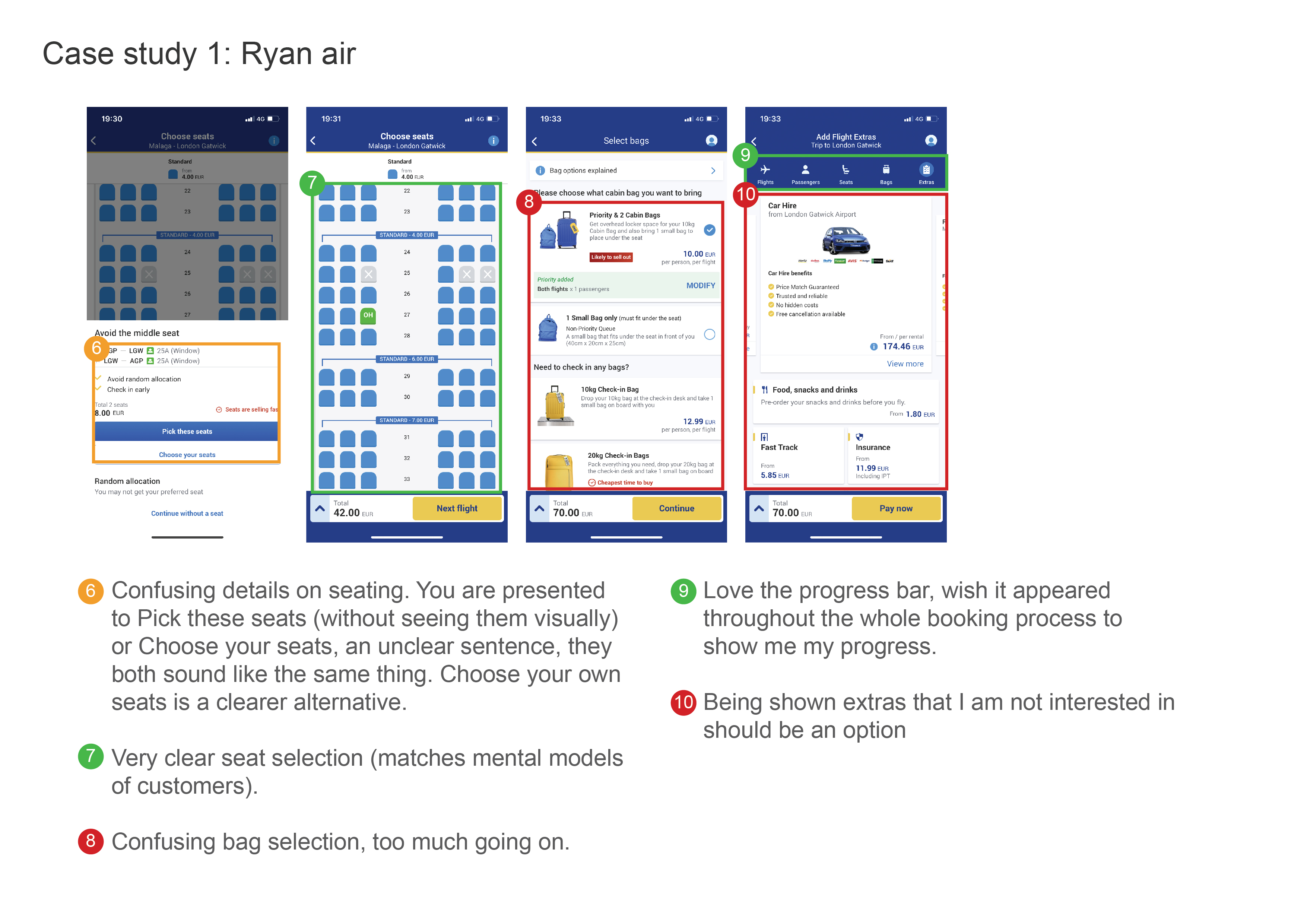
Research and analysis was conducted to undersand the data collected. Using a variety of techniques gave way to a more holistic approach which inturn resulted in richer information to work from. The methods included competetive benchmarking, online surveys, note taking and usability testing. 1.1 Competitive Benchmarking
I began by going through the process of competitive benchmarking. It was important to understand the industry patterns used by other airline companies in the market. It helped me gained insights on common design conventions, processes and pain points.
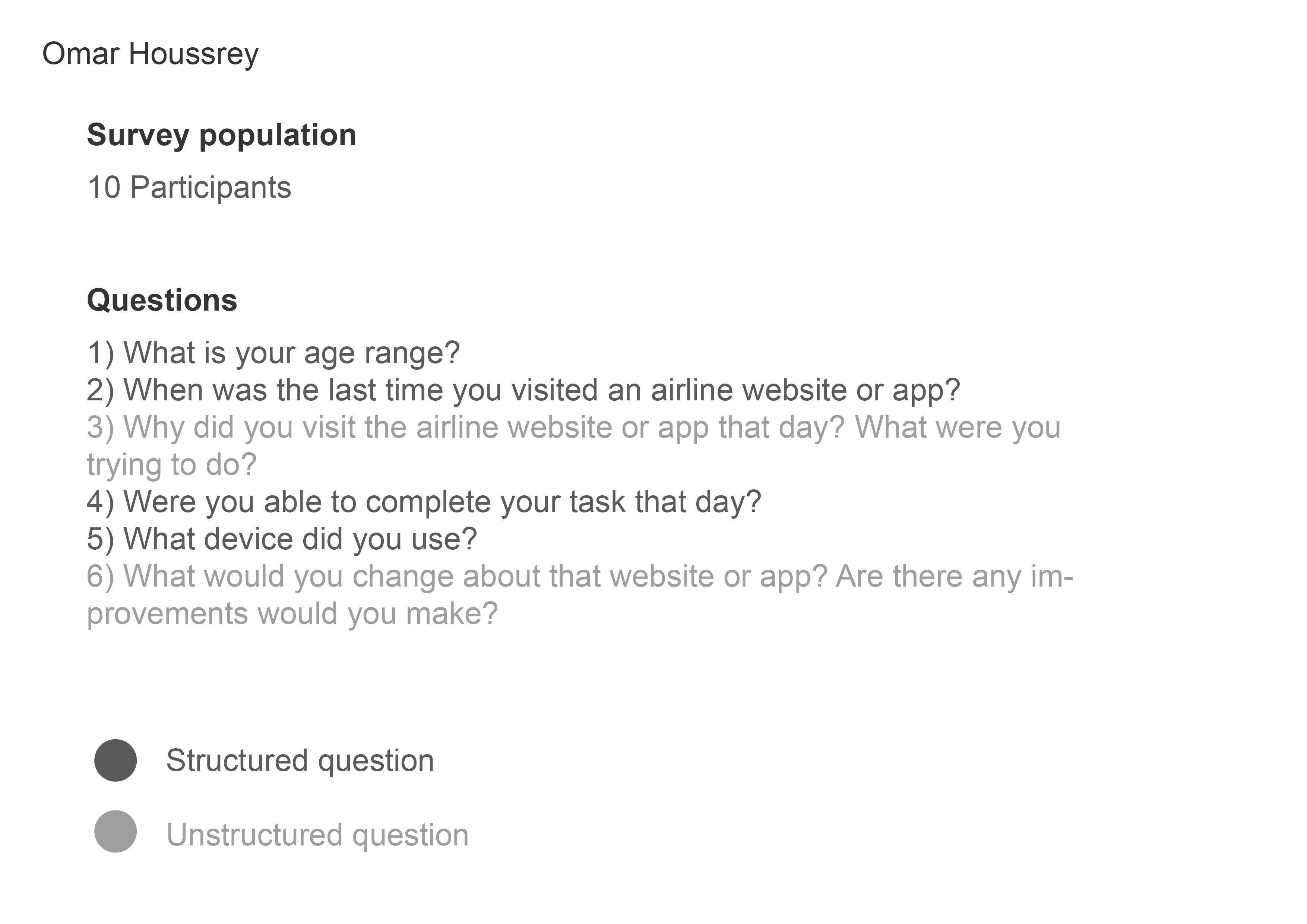
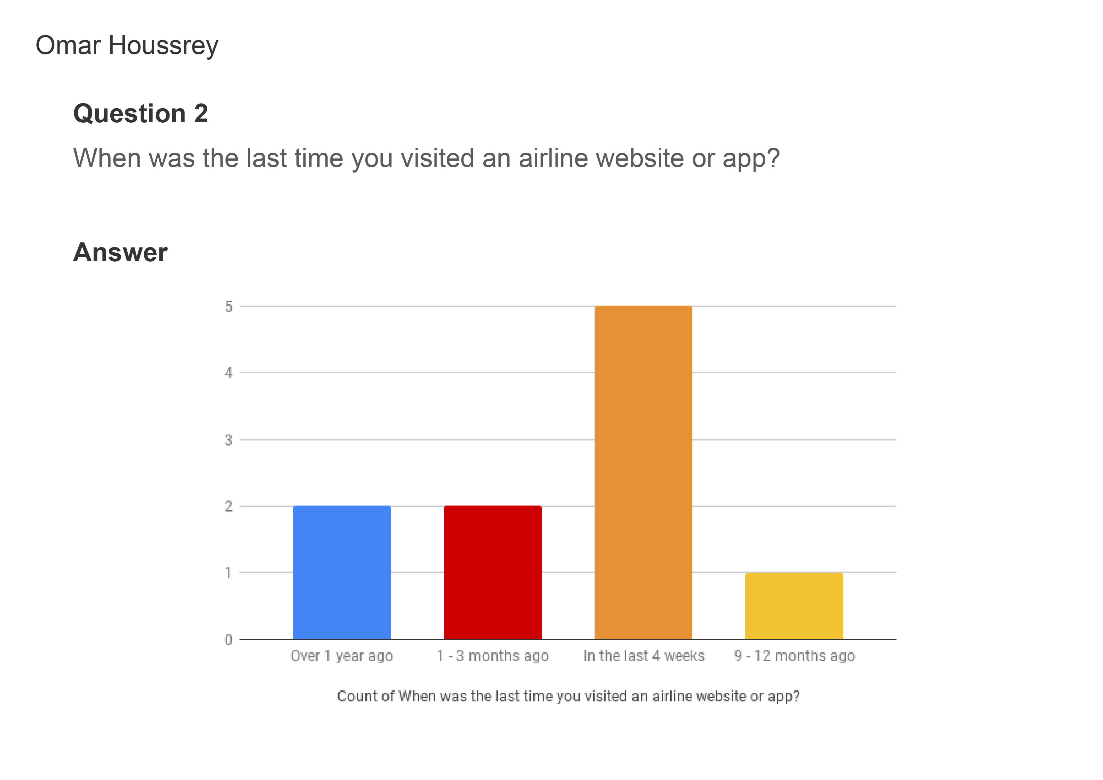
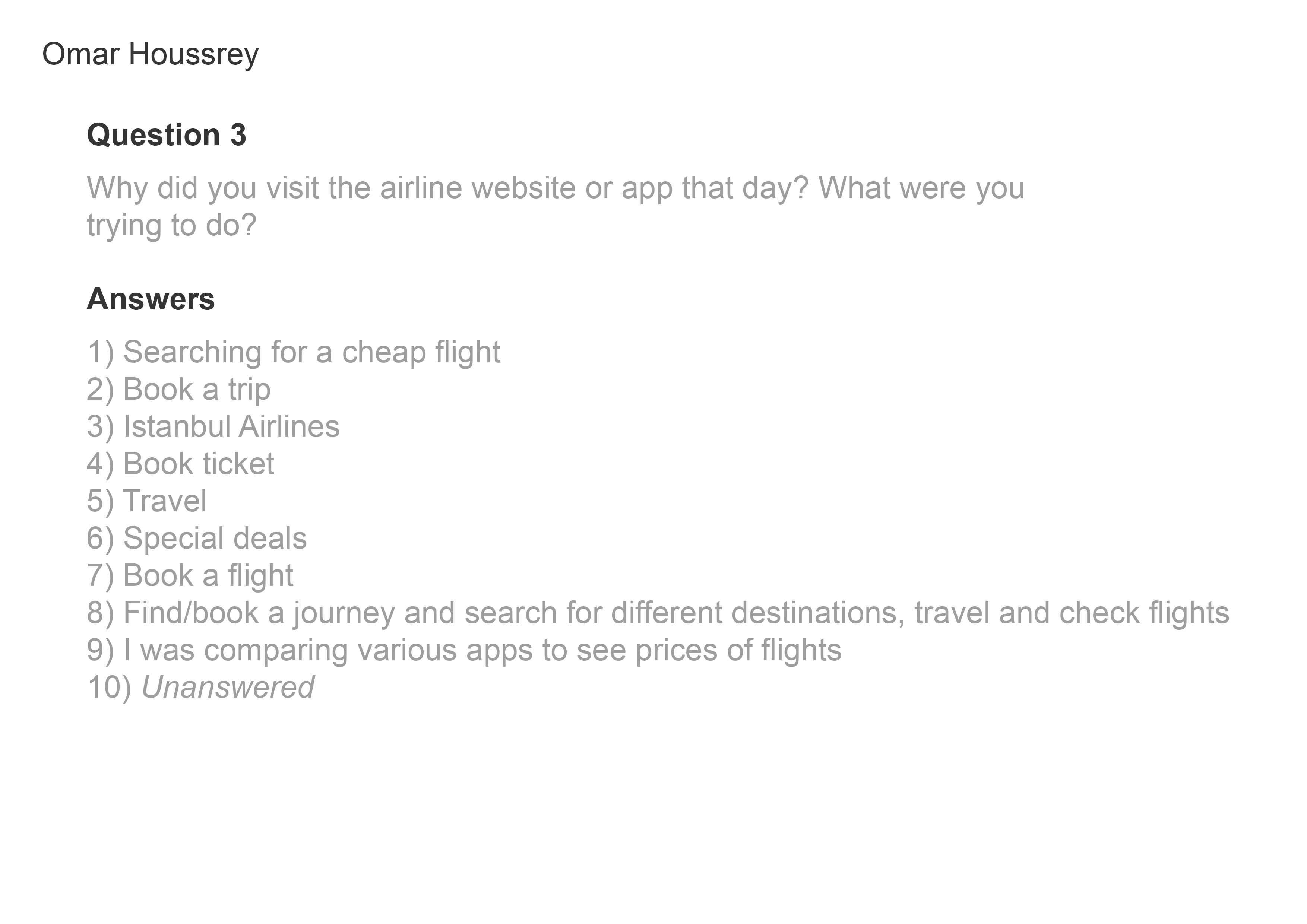
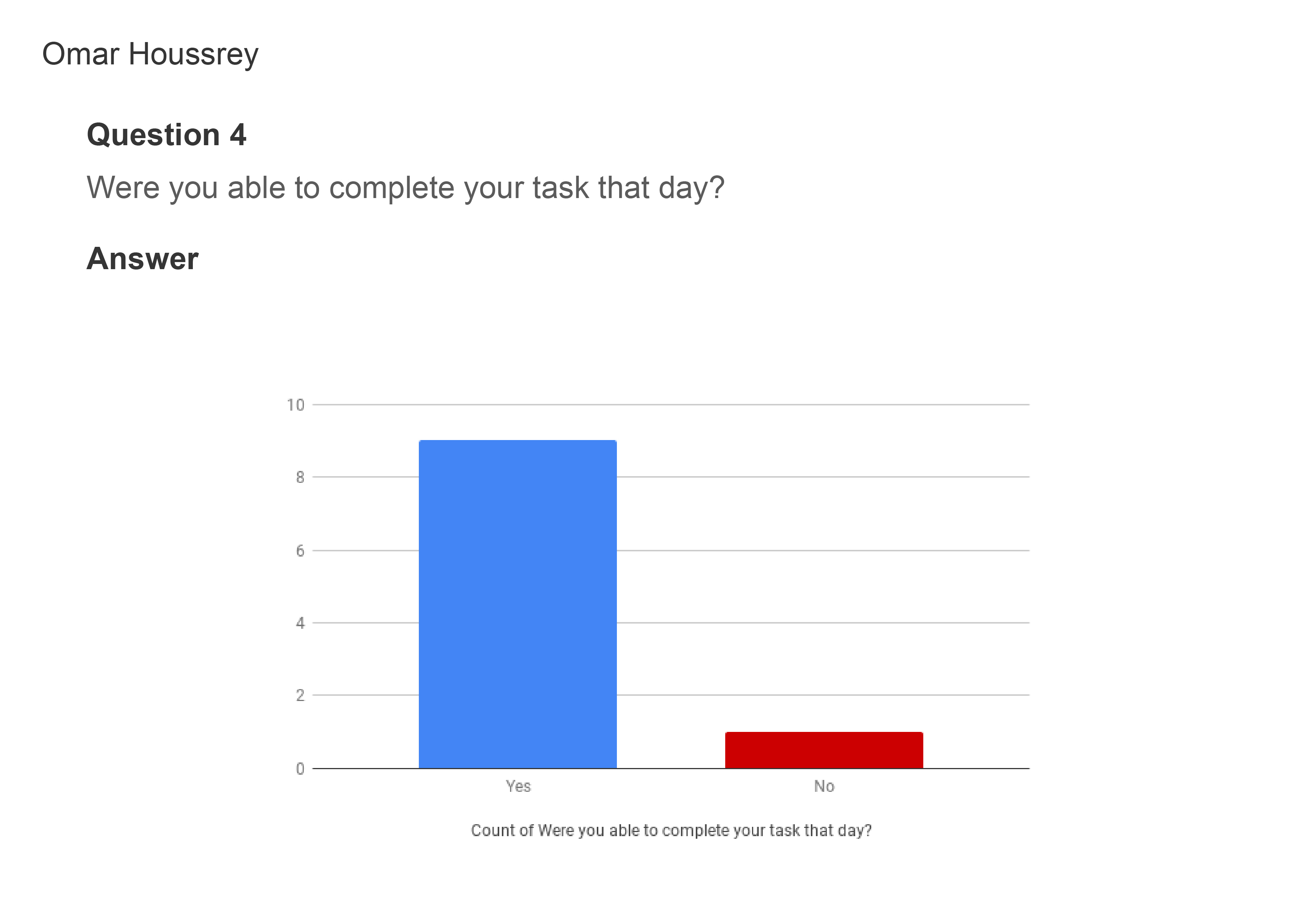
1.2 Online survey
A survey was conducted to learn more about the goals of potential customers. The data gathered helped make more informed design decisions later on in the process.

1.3 Note taking
Taking notes during a usability test of an existing airline app. This step forced me to concentrate on the most important information in real time, taking notes of the positive and negative aspects of the user experience.


1.4 Usability testing
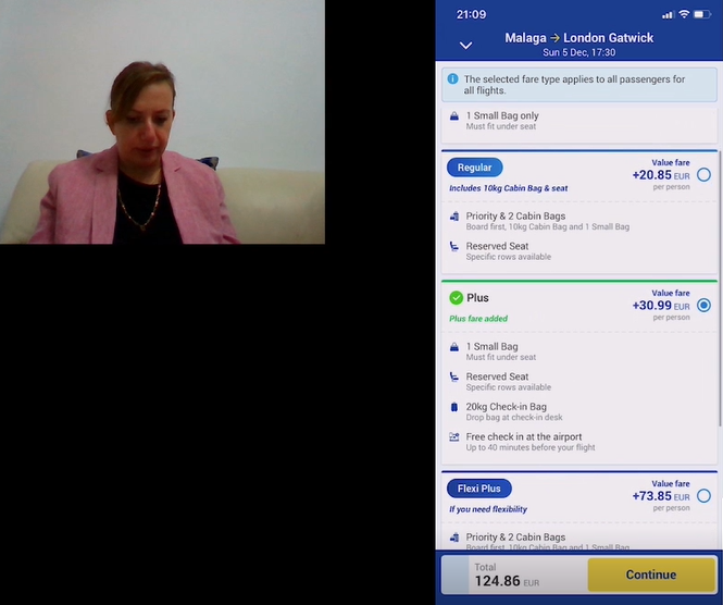
An interview and usability test conducted in order to gain greater insights into how frequent flyers find the booking process. A popular airline was used to conduct the recording and the participent voiced their positive and negative opinions, their struggles and suggested improvements. This was by far one of the best ways to recieve data as it was dealing directly with the target audience.
2. DEFINE:
After conducting research and analysing it, it was time to define the relevant information into groups to be able to resolve them. This took the form of affinity diagrams and customer journey maps.
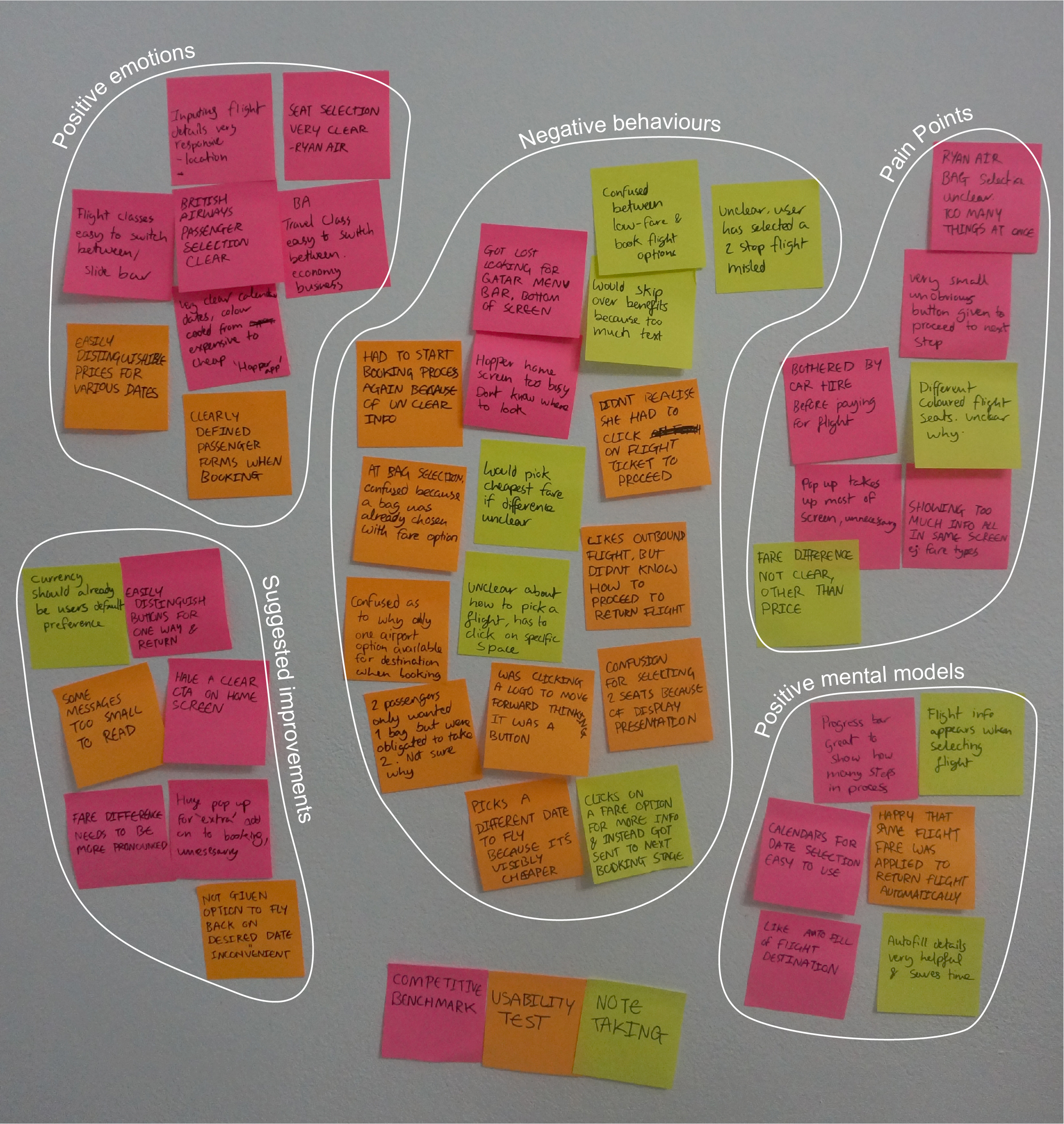
2.1 Affinity diagram
Notes were recorded from all the previous research methods and writen on post-it notes. Arranged on a wall, each page of info was eventually grouped together in a way that made sense. This was done in order to find commonalities and to get a better sense of what works and what improvements to make.
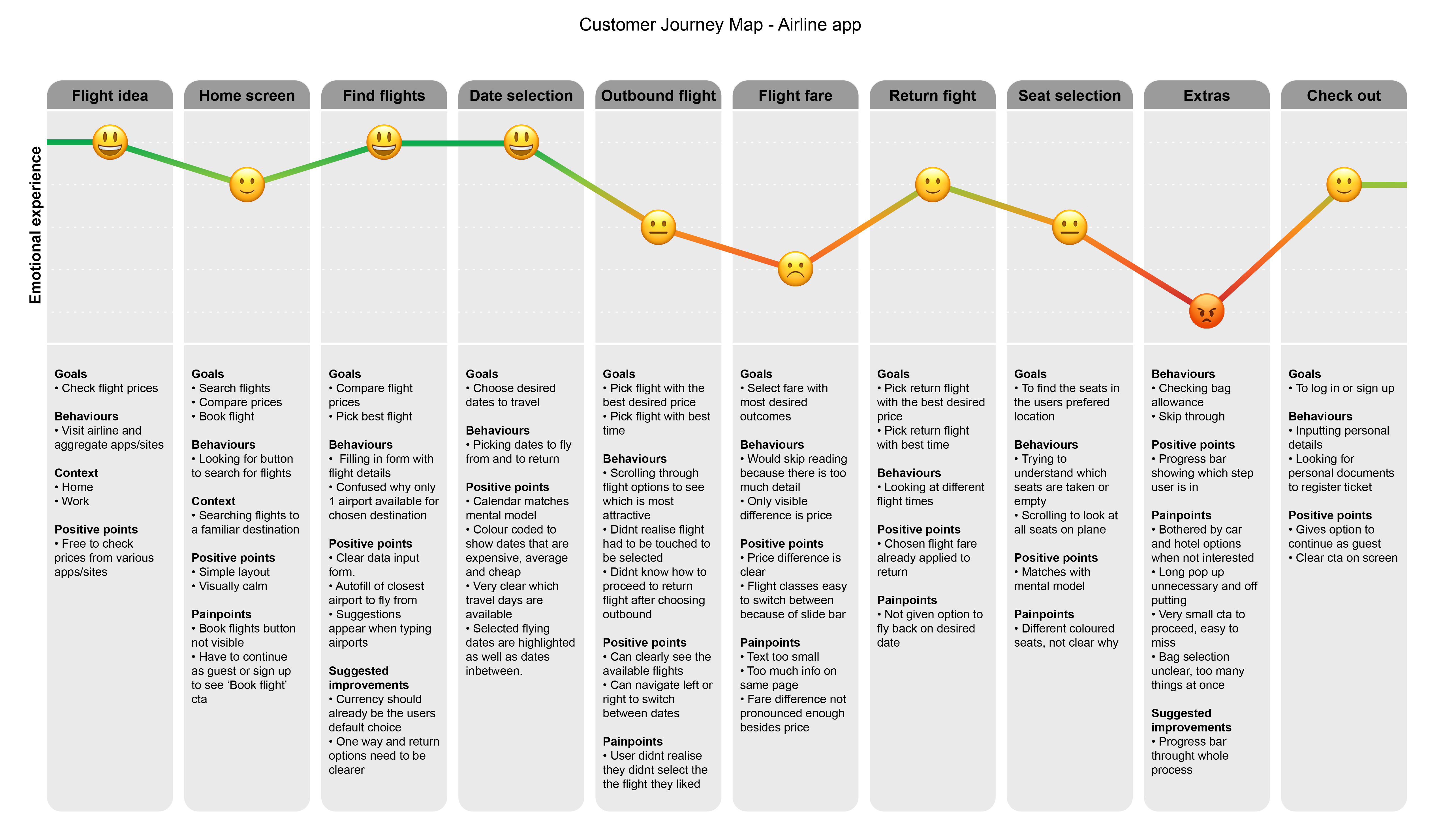
2.2 Customer Journey Map
The customer journey map was created in order to clearly illustrate the classifications made in the affinity diagram and asociating it with an emotional response. It is an early foundation for the user flow diagrams to come.
3. DESIGN & PROTOTYPE:
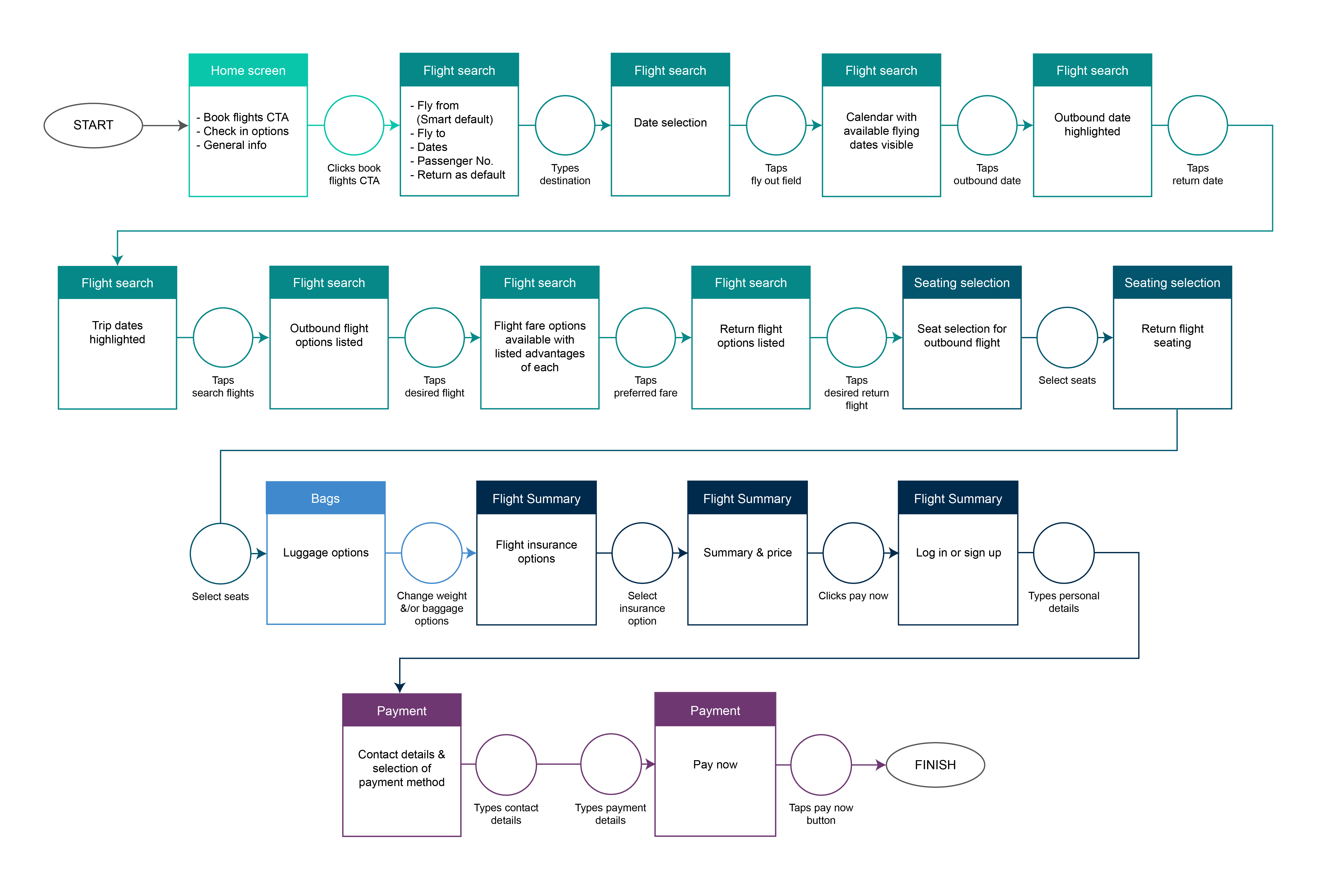
After analyzing the data it was time to begin with the design process. This began by creating a main flow based off the previous steps. After an estimate flow is created, a low, mid and high fidelity prototypes are created to further refine the the final prototype.3.1 Flow diagram
It is here where the steps of the booking process are defined. Different colours represent the various sections of the process.
3.2 Low fidelity design
Initial sketches of the main user flow. A foundation from which developments can form.
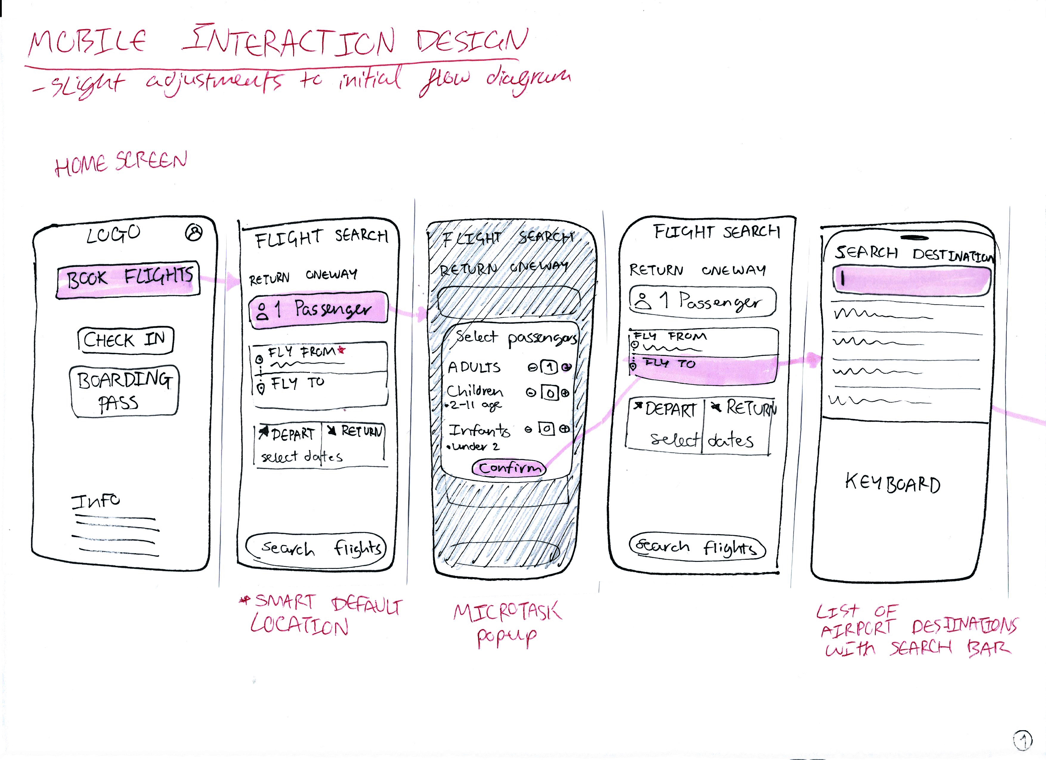
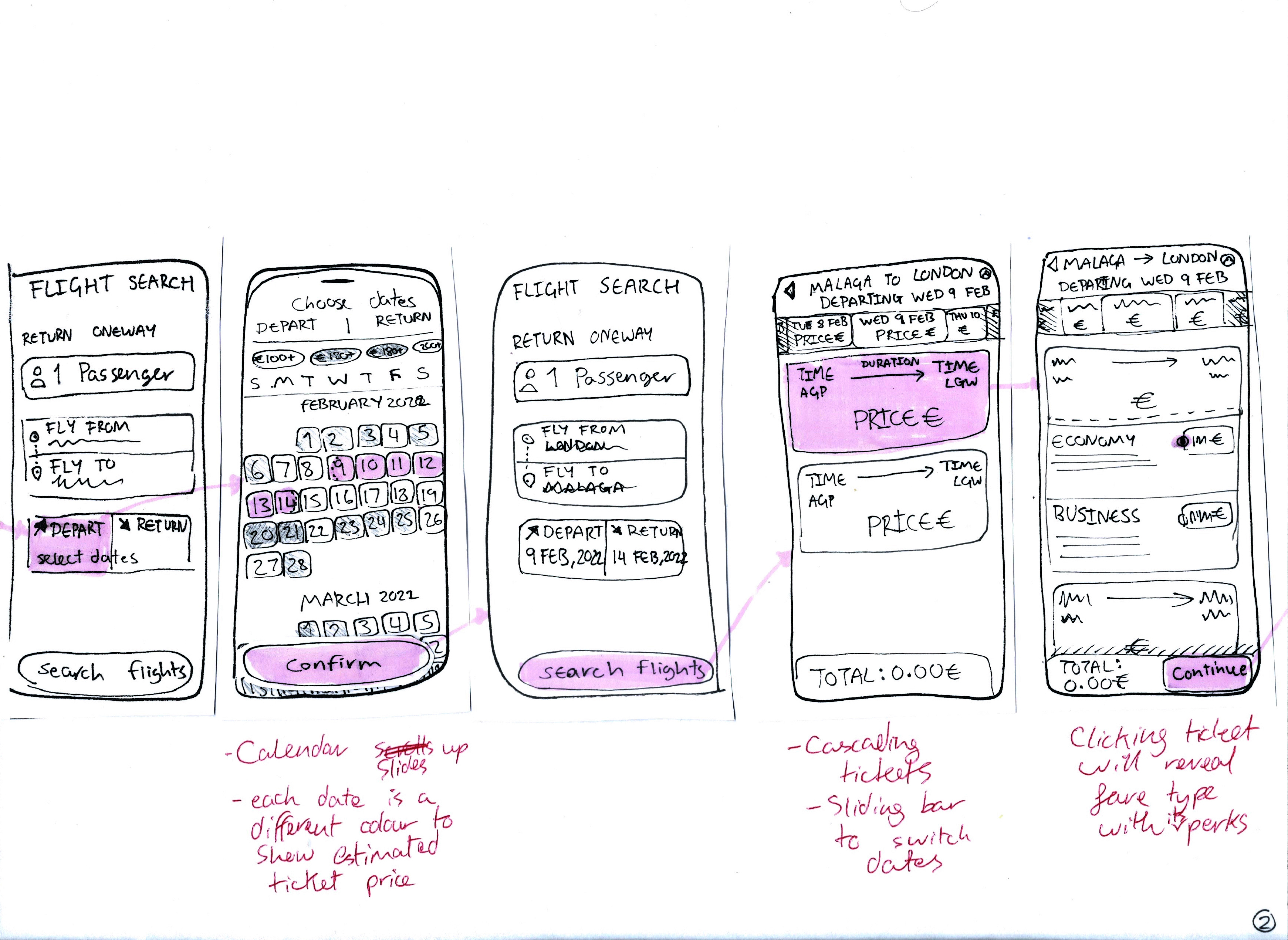
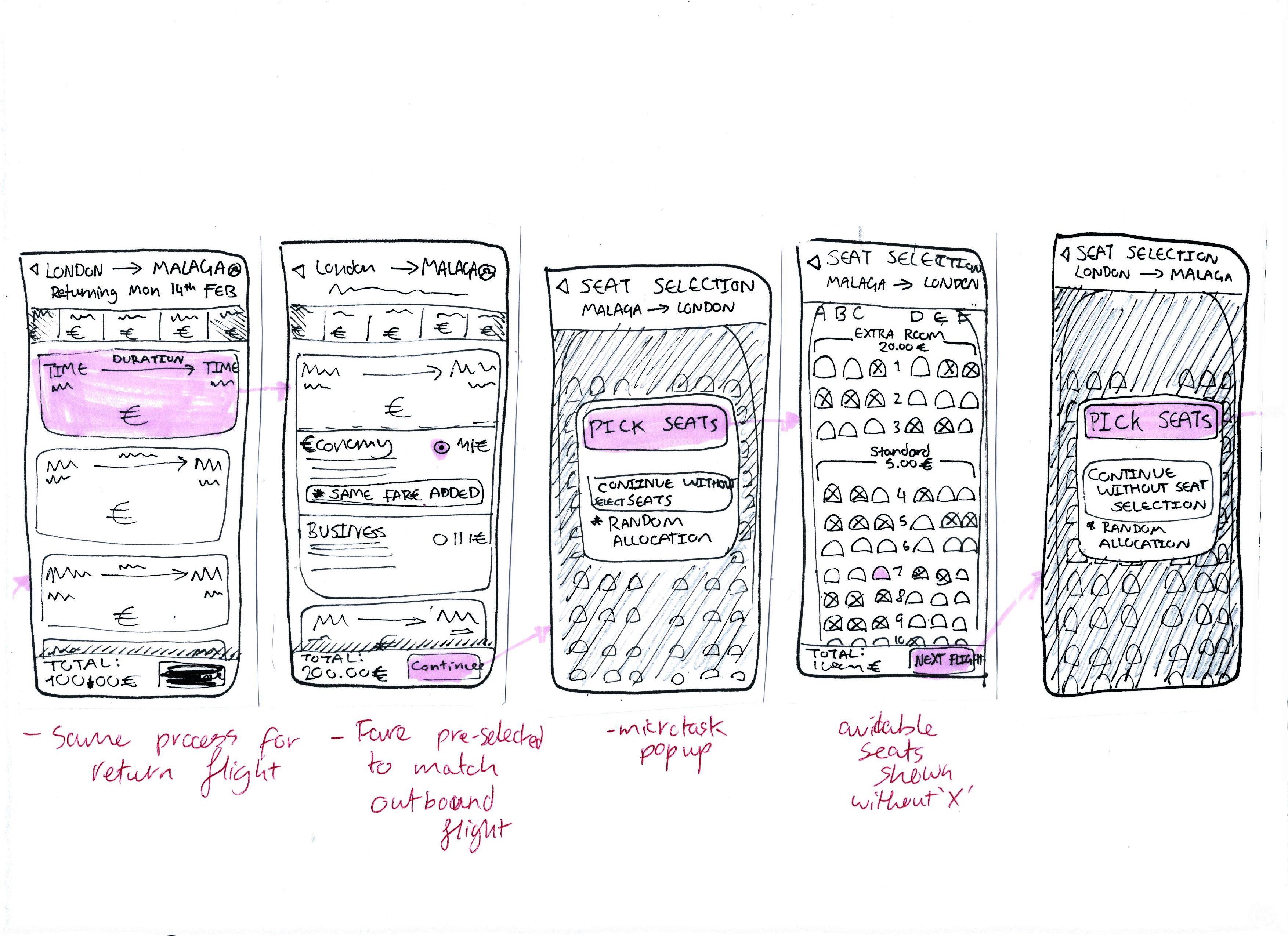
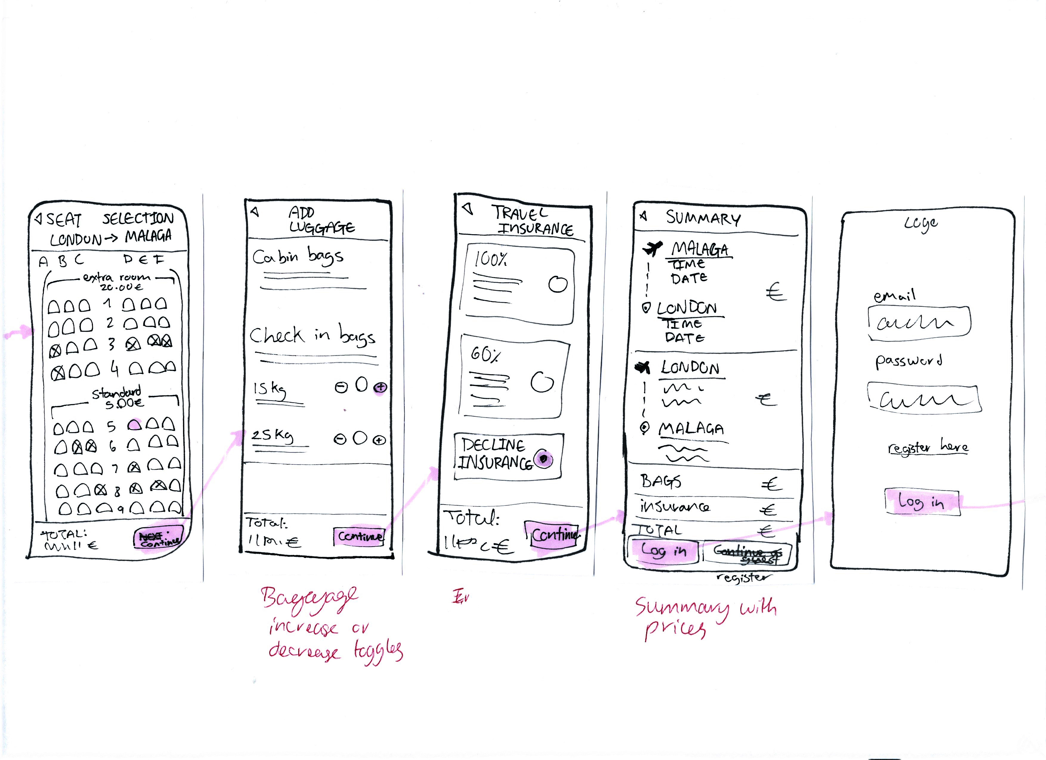
3.3 Medium fidelity design
A step up from the initial sketches, this design opened a lot of holes in the flow which werent visible previously. Definetly a useful step to take before the final prototype.

4. PROTOTYPE:
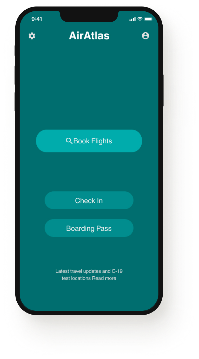
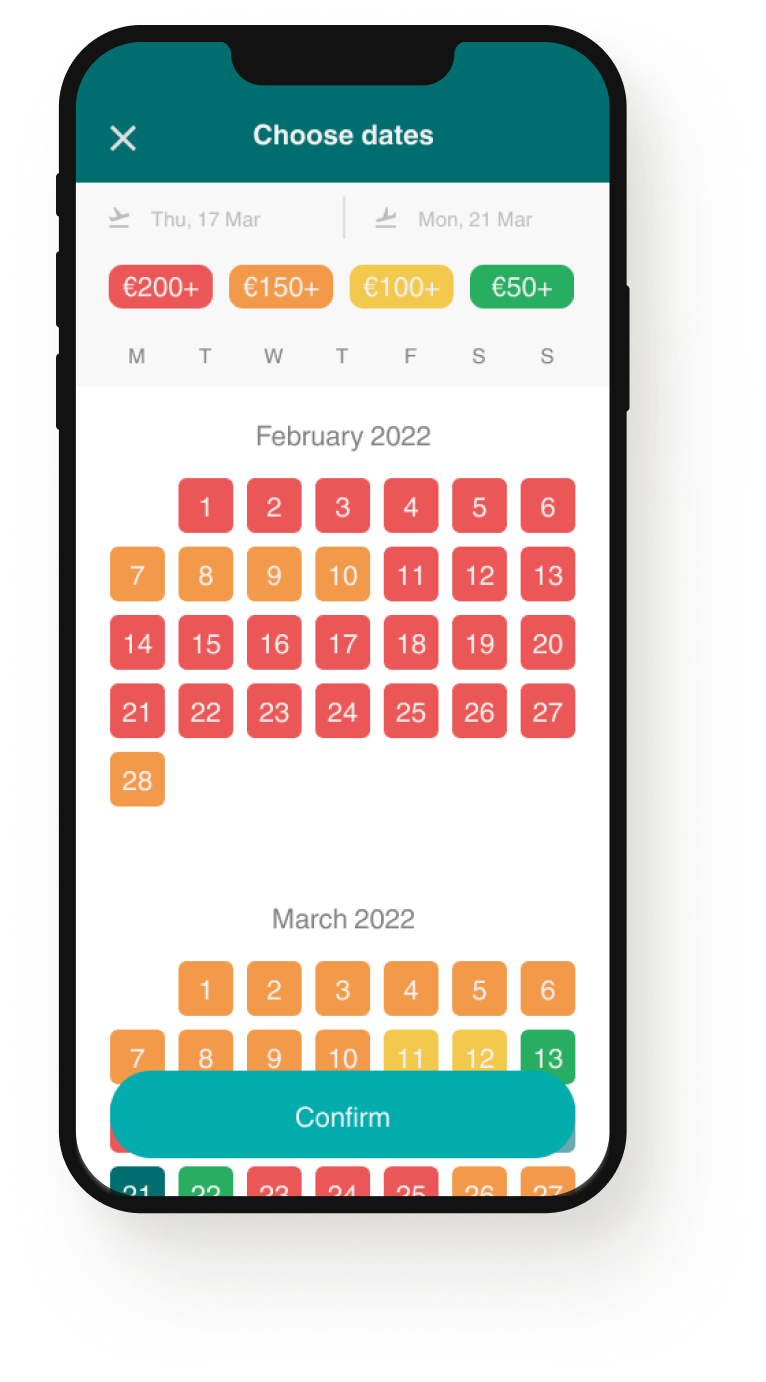
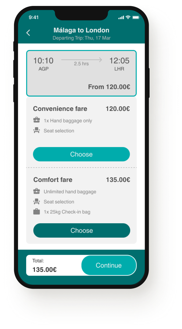
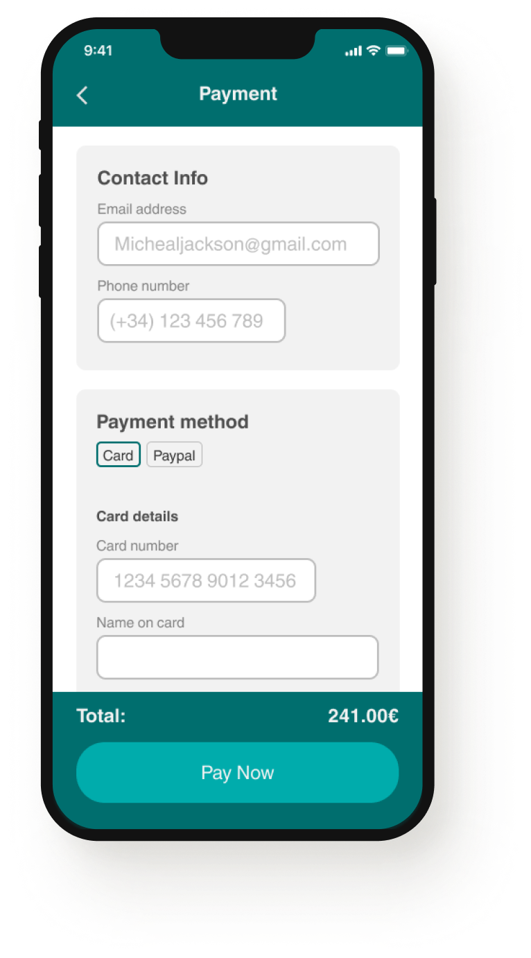
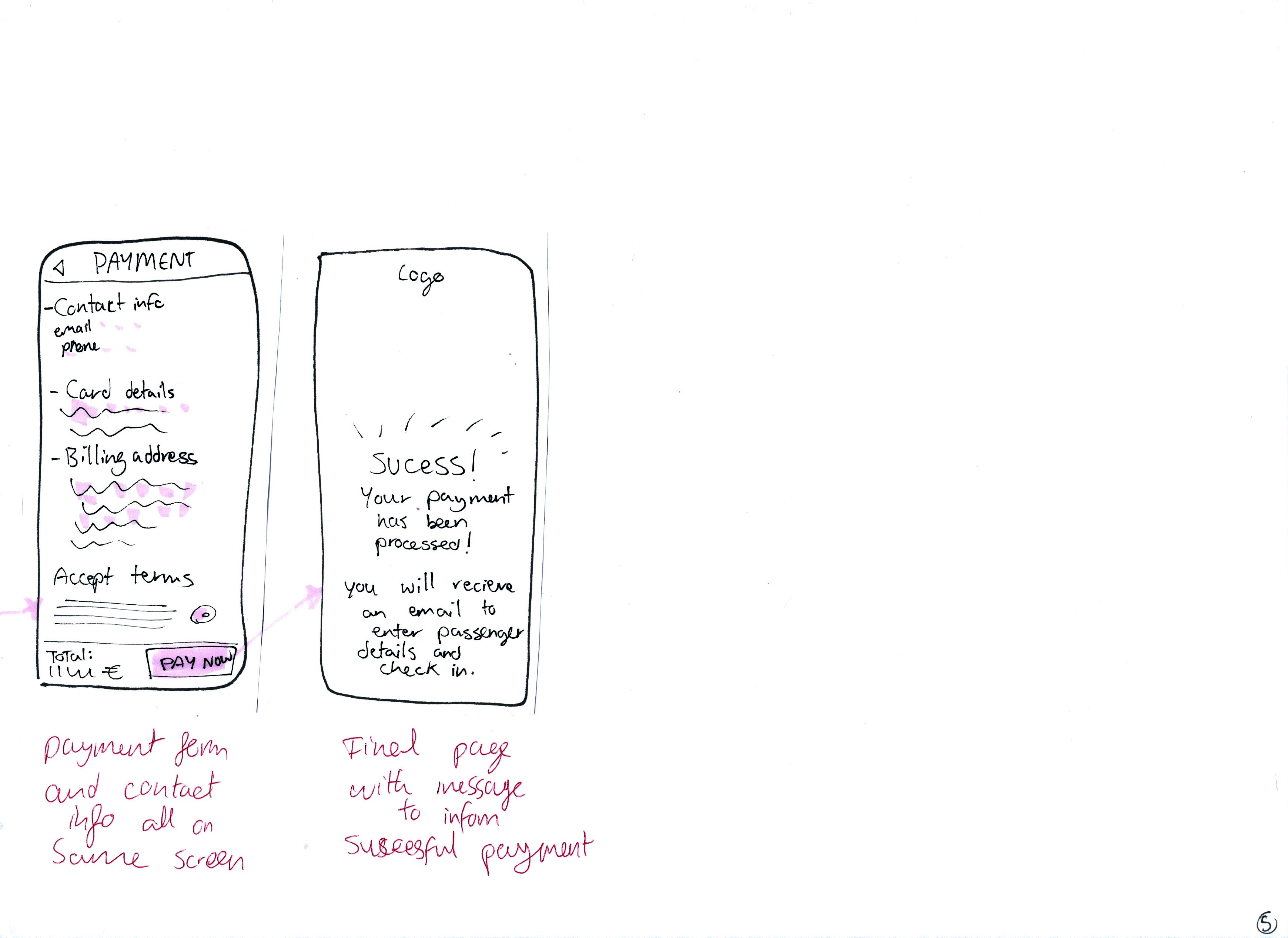
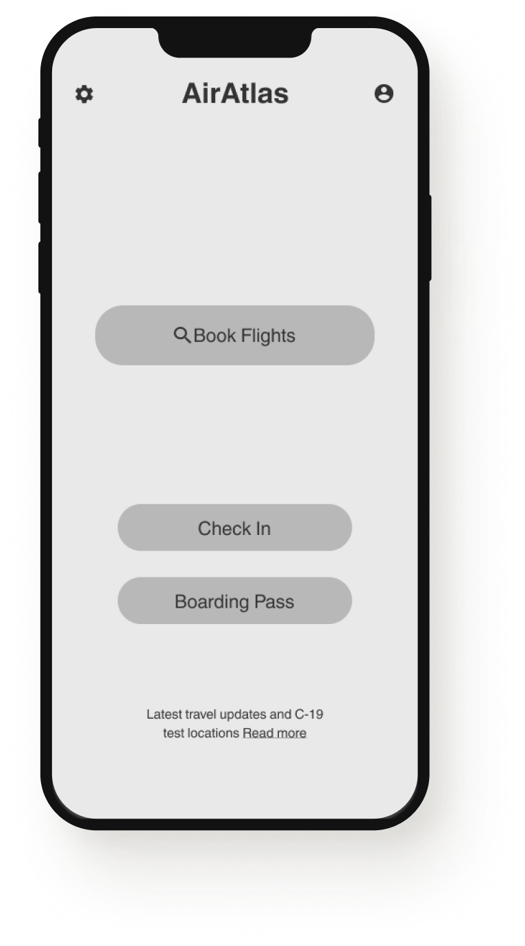
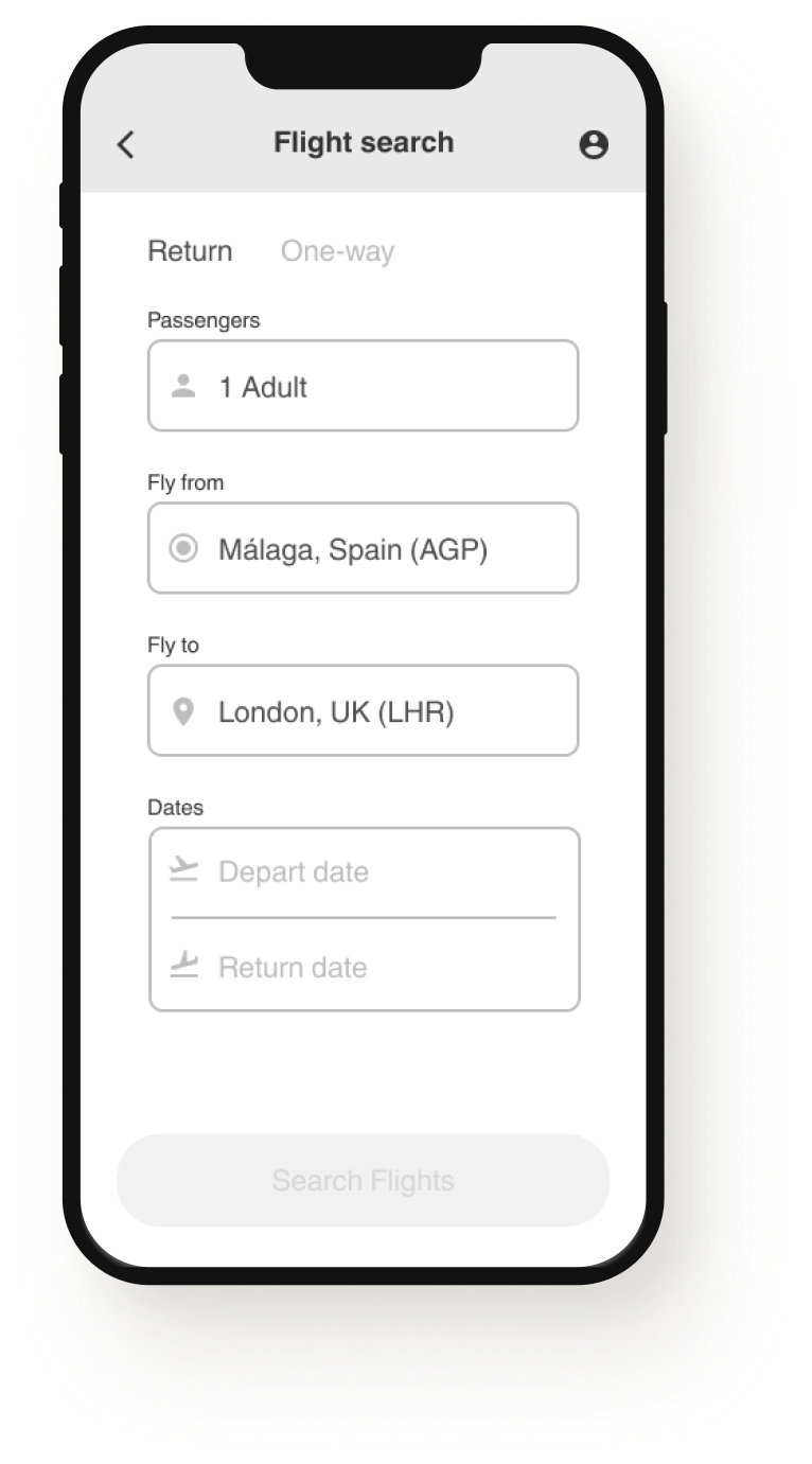
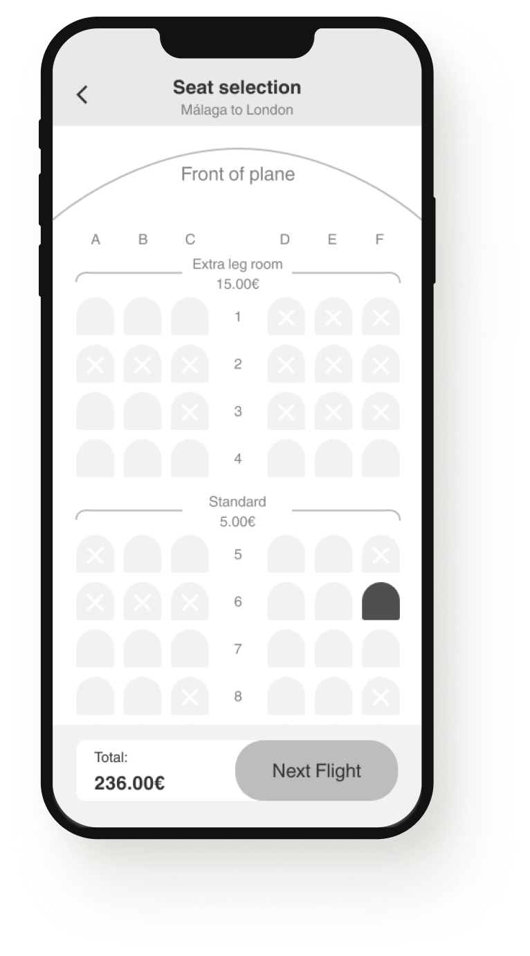
The final prototype design, including branding colours and finalized layouts.
The main flow follows the following narrative:
Test the prototype HERE︎︎︎
The main flow follows the following narrative:
-
1 passenger
-
Flying to London, UK (LHR)
- Departing March 17th and returning the 21st
- Prefers the earliest flights possible
- Comfort Fare
- Prefers the cheapest and closest window seats to the front, on the right side of the plane
- No extra baggage
- No insurance
- Prefers to continue as a guest
Test the prototype HERE︎︎︎